
MRIDU Indian Perfume
Branding & Packaging Design | Passion Project

About the Brand
MRIDU is an Indian perfume brand whose name is derived from Sanskrit, meaning soft, gentle, and delicate. This meaning forms the foundation of the brand’s identity and reflects the subtle yet evocative nature of its fragrances.
The scent collection is inspired by some of India’s most iconic and culturally significant flowers - Jasmine ( Mogra ), Lotus ( Kamal ), and Marigold ( Genda ). Each fragrance captures a distinct facet of the country’s sensory landscape, from the calming elegance of lotus to the rich warmth of marigold and the timeless softness of jasmine. By using these floral notes as the core of the brand, MRIDU aims to evoke the scent of India as a whole.
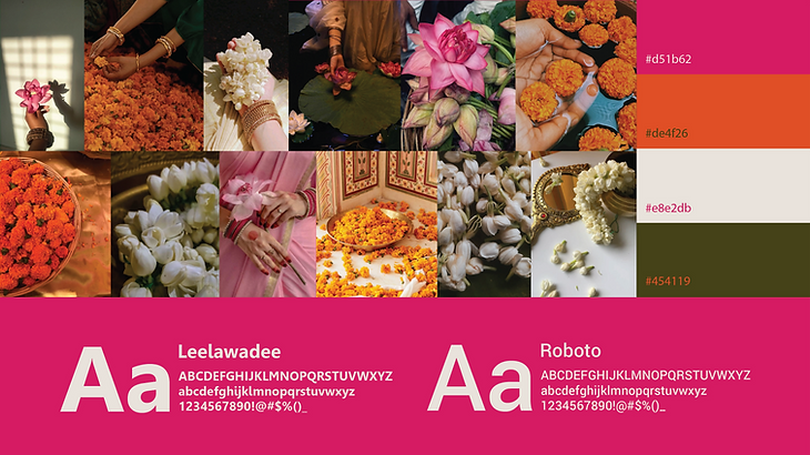
Moodboard, Color Palette and Font
The moodboard was developed to visually express the soul of the MRIDU brand through a curated selection of imagery and color. Photographs of marigold, lotus, and jasmine are included in the moodboard. These florals serve as both a sensory and symbolic reference, enhancing the brand’s connection to India’s heritage and traditions.
The color palette - pink, orange, off-white and green was chosen to reflect the softness and warmth embodied by the name MRIDU. Pink balances boldness with intimacy, orange adds depth and cultural richness, off-white provides a sense of calm and elegance, and green represents freshness and balance. These tones together create a harmonious visual language that feels expressive yet refined, capturing the coexistence of softness and vibrancy and setting the foundation for the brand’s overall aesthetic and design direction.
The selected fonts are clean and highly legible, ensuring clarity on packaging while complementing the logo's visual identity.
Logo Design
The logo is centered around the Devanagari letter “म” (M), serving as a strong and culturally rooted symbol for the brand. Devanagari was intentionally chosen to emphasize MRIDU’s Indian identity, as it is the script traditionally used for Sanskrit - the language from which the brand name is derived.
This choice reinforces authenticity and creates a direct visual connection to the brand’s cultural origins.
Additional graphic elements were integrated around the letterform to subtly resemble the silhouette of a perfume bottle. This transformation allows the letter “म” to function both as a typographic mark and a symbolic representation of the product itself, clearly communicating that MRIDU is a fragrance brand.
The result is a logo that blends cultural significance with contemporary design, creating a distinctive and meaningful brand mark.

Packaging Design
The packaging design brings together the complete MRIDU color palette - pink, orange, off-white, and green to create a vibrant yet balanced visual identity.
Illustrations of jasmine, lotus, and marigold are repeated in a small-scale pattern across the packaging, adding texture and visual depth without overwhelming the design. This repetitive floral treatment supports the fragrance inspiration while creating a sense of continuity and rhythm. The subtle detailing allows the packaging to feel elegant and tactile, drawing the viewer in upon closer inspection.
In contrast to the expressive outer packaging, the perfume bottle is intentionally kept minimal. The design focuses on the MRIDU logo, which is applied in different color variations from the brand palette. This restrained approach allows the logo to take center stage while ensuring each fragrance remains visually distinct. The bottle and packaging create a cohesive system that balances simplicity with ornamentation.


Brand Identity


